Historic Trends
Use the Historic Trends dashboard to view inventory history for all dairies from the past year. Use one of the many provided metrics to break down the inventory history further to learn more about your dairies. For example, you can check metrics for specific health events, such as Total Mastitis![]() Mastitis is the persistent, inflammatory reaction of the udder tissue due to physical trauma or infection. Symptoms of mastitis include udder swelling, heat, hardness, redness, or pain. The milk may have a watery appearance, flakes, clots, or pus. Incidences, to see whether cases of mastitis
Mastitis is the persistent, inflammatory reaction of the udder tissue due to physical trauma or infection. Symptoms of mastitis include udder swelling, heat, hardness, redness, or pain. The milk may have a watery appearance, flakes, clots, or pus. Incidences, to see whether cases of mastitis![]() Mastitis is the persistent, inflammatory reaction of the udder tissue due to physical trauma or infection. Symptoms of mastitis include udder swelling, heat, hardness, redness, or pain. The milk may have a watery appearance, flakes, clots, or pus. have increased or declined in the past year.
Mastitis is the persistent, inflammatory reaction of the udder tissue due to physical trauma or infection. Symptoms of mastitis include udder swelling, heat, hardness, redness, or pain. The milk may have a watery appearance, flakes, clots, or pus. have increased or declined in the past year.
Follow the guidelines below when viewing the Inventory dashboard:
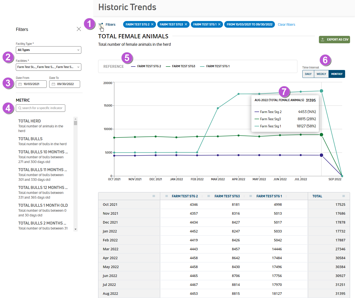
- Filters: Click the Filters option on the upper left side of the dashboard to open a side panel where you can manage the data you see in the graph:
- Facility filters: Use the Facility Type and/or Facilities filters to manage the facilities shown in the graph. Facilities are listed by dairy name. By default, the graph includes data from all dairies.
- Date Range filter: Use the
- Metric filter: Select the specific metric you want to view. There are many metrics to choose from by animal type (female animals, bulls, cows, heifers), age, lactation number, health event, herd change, and breed. For example, you can view the number of bulls, the number of metritis
 Metritis is inflammation of the wall of the uterus, and usually occurs within days of calving. Symptoms of metritis are an enlarged uterus and a foul-smelling uterine discharge. cases, or the number of Holsteins you've had across all dairies in the past month.
 - Total Herd
- Total Animals Born On Date
- Total Animals Departure On Date
- Total Animals Died On Date
- Total Animals Dry On Date
- Total Animals Entering Herd On Date
- Total Animals Go Home On Date
- Total Animals Sold On Date
- Total Female Animals
- Total Female Animals Fresh On Date
- Total Female Animals Born On Date
- Total Female Animals Departure On Date
- Total Female Animals Died On Date
- Total Female Animals Bred
- Total Female Animals Do Not Breed
- Total Female Animals Dry
- Total Female Animals Fresh
- Total Female Animals Open
- Total Female Animals Pregnant
- Total Cows
- Total Cows Close Up
- Total Cows Due Dry
- Total Cows Far Off
- Total Cows Hospital
- Total Cows Milking
- Total Cows To Tank
- Total Cows Departure On Date
- Total Cows Died On Date
- Total Cows Dry On Date
- Total Cows Entering Herd On Date
- Total Cows Fresh On Date
- Total Cows Sold On Date
- Total [Lactation Number] Cows
- Total [Lactation Number] Cows Departure On Date
- Total [Lactation Number] Cows Died On Date
- Total [Lactation Number] Cows Dry On Date
- Total [Lactation Number] Cows Entering Herd On Date
- Total [Lactation Number] Cows Fresh On Date
- Total [Lactation Number] Cows Go Home On Date
- Total [Lactation Number] Cows Sold On Date
- Total [Lactation Number] Cows Bred
- Total [Lactation Number] Cows Do Not Breed
- Total [Lactation Number] Cows Dry
- Total [Lactation Number] Cows Fresh
- Total [Lactation Number] Cows Open
- Total [Lactation Number] Cows Pregnant
- Total [Lactation Number] Cows Not Specified
- Conception Rate For Lactation > 0 Cows
- Total Heifers
- Total Heifers [Age]
- Total Heifers Close Up
- Total Heifers Far Off
- Total Heifers Entering Herd On Date
- Total Heifers Go Home On Date
- Total Heifers Sold On Date
- Total Heifers Bred
- Conception Rate For Heifers
- Total Heifers Do Not Breed
- Total Heifers Unspecified
- Total Heifers Open
- Total Heifers Pregnant
- Total Bulls
- Total Bulls [Age]
- Total Bulls Born On Date
- Total Bulls Departure On Date
- Total Bulls Died On Date
- Total Bulls Entered Herd On Date
- Total Bulls Go Home On Date
- Total Bulls Sold On Date
- Health Events
- Total [Health Event] [Lactation Number] [DIM Days in milk]
- Total Mastitis Incidences
- Total Pneumonia Pneumonia is lung inflammation caused by a bacterial or viral infection. Early symptoms may include fever, depression, reduced appetite, nasal and eye discharge, salivation, shallow breathing, and soft coughing. Incidences
- Total Lame Lameness includes any abnormality which causes an animal to change the way it walks, and can be caused by a range of foot and leg conditions, including hoof ailments, hock damage, bruising, sores, or cuts. Incidences
- Total Scours Diarrhea in young animals. Scours causes dehydration in calves and is the leading cause of death in calves under one month of age. Incidences
- Total Metritis Incidences
- Total Retained Placenta Retained placenta is the failure to expel fetal membranes within 24 hours after parturition. The primary symptom of a retained placental is degenerating, discolored, and ultimately fetid membranes hanging from the vulva. Incidences
- Total Ketosis Ketosis is a common ailment that usually occurs in early lactation, when the energy demands of milk production are very high and the cow metabolizes fat stores for energy. Symptoms of ketosis may include reduced milk yield, weight loss, reduced appetite, acetone smell of breath and/or milk, and fever. Incidences Lactation
- Total Milk Fever Milk fever is a disease characterized by reduced blood calcium levels. It occurs in early lactation, when demand for calcium for colostrum and milk production exceeds the cow's ability to mobilize calcium. "Fever" is a misnomer, as body temperature during the disease is generally not elevated. Milk fever symptoms include tremor in the muscles of the head and limbs until falling to a "sitting" position. Once down, cows may have a dry muzzle, staring eyes, cold legs and ears, constipation, and drowsiness. Incidences Lactation
- Total Displaced Abomasum Displaced abomasum in cattle occurs when the abomasum, also known as the true stomach, which typically resides on the floor of the abdomen, fills with gas and rises to the top of the abdomen, where it is said to be "displaced". Symptoms may include reduced appetite, lower milk yield, reduced rumination, and a distended abdomen. Incidences
- Breed
- Bulls Breed [Breed Name]
- Heifer Breed [Breed Name]
- [Lactation Number] Breed [Breed Name]
- References: Each facility is represented on the graph by its own colored line.
- Time interval: On the upper right side of the dashboard, you can select the time interval shown in the graph:
- Daily: See 30 days of data by default.
- Weekly: See 20 weeks of data by default.
- Monthly: See 12 months of data by default.
- Tooltips: Hover over the graph data to view more detailed information, including animal counts and percentages.
Last Built: November 11, 2025